Brand logo
Creating Credit Saison
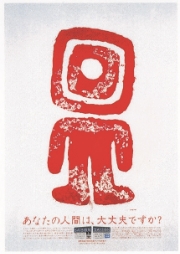
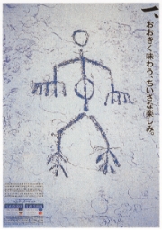
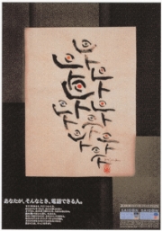
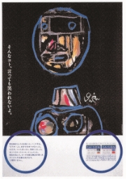
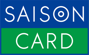
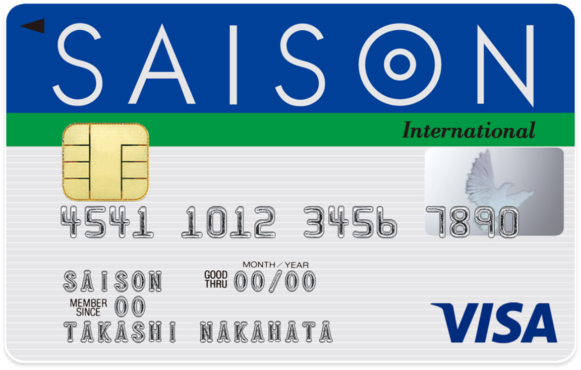
The origin of the Saison Card brand logo was the concept of credit cards as a communication tool offering consumers different kinds of information, rather than just a simple means of payment at the time the Saison Card began in 1983. The design was created by the late Ikko Tanaka, a leading graphic designer of the Showa era. Since then, it has gained wide recognition among our customers as the brand image of our company and all of its services, greatly contributing to the development of our company and the creation of its world view. In 2019, while retaining the corporate colors of Saison Blue and Saison Green, the design was simplified for improved visibility, with the visual elements of the design and the corporate colors were strategically unified to create the Saison brand Visual Identity.
Brand colors
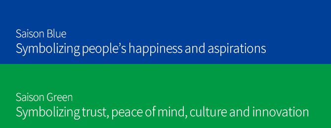
The Saison Card’s brand colors are Saison Blue and Saison Green
The Saison Card’s brand colors are our corporate colors, Saison Blue and Saison Green, which express our unwavering determination to be close to our customers' lives and bring about a prosperous society as a leading-edge service company. The Saison Blue and Saison Green logo has contributed to the establishment of our brand and has become an inextricable part of its identity.

Origin of the Saison Card’s name
The Saison Card was named after the four seasons
The card was first issued in 1982 as the Seibu Card, a common card for the Seibu Ryutsu Group (Saison Group). In 1983, in anticipation of the full-scale transformation of the card business, including the shift from the house card strategy of the time to the affiliated card strategy and the conversion to international cards, the name Saison, from the French word for season, was adopted to suggest a card for all the seasons of year, and the Saison Card was born.
The SAISON spirit, the desire to provide even more convenient payment methods to customers, continues to inform the development of all our services.
Corporate fonts
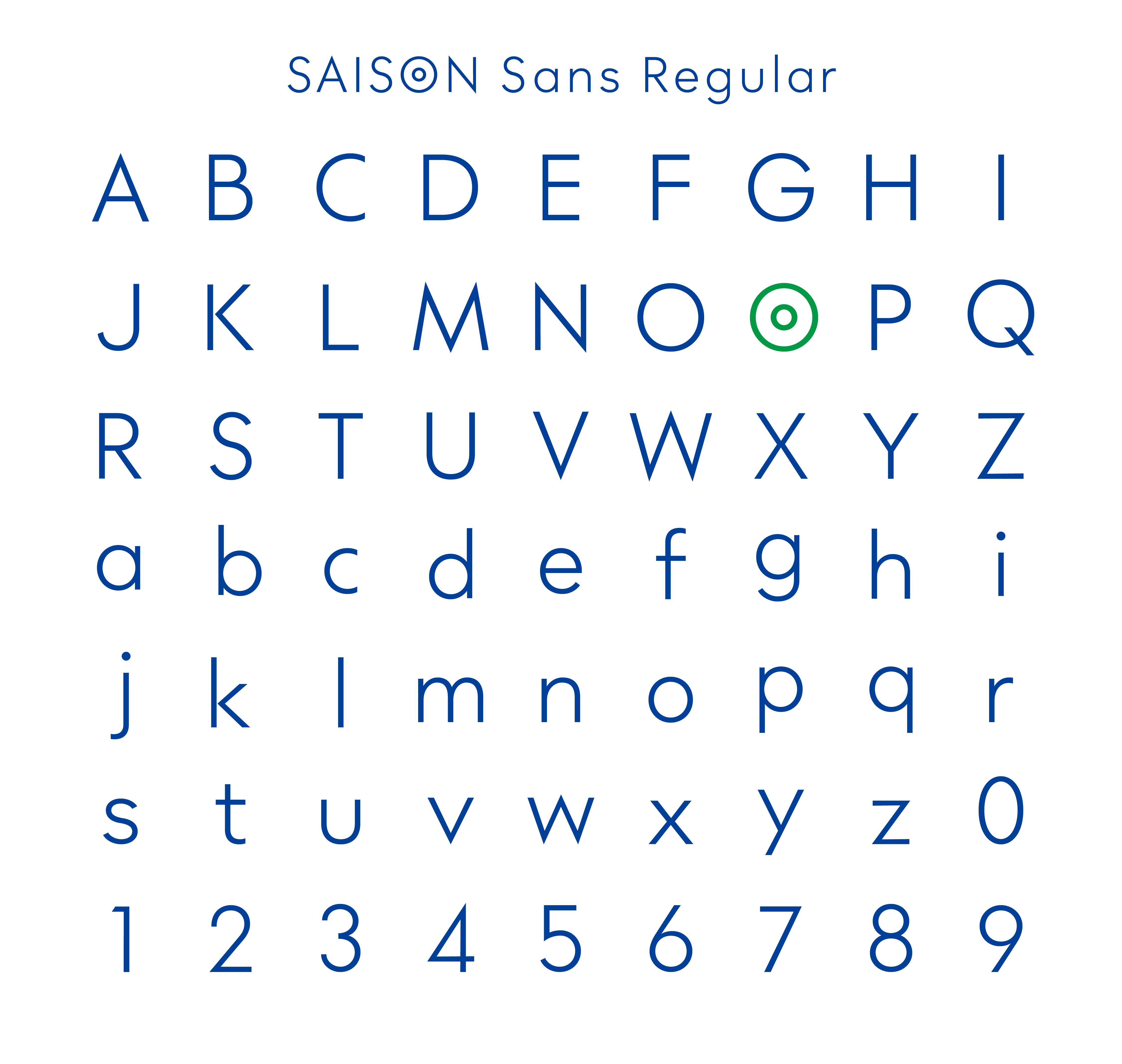
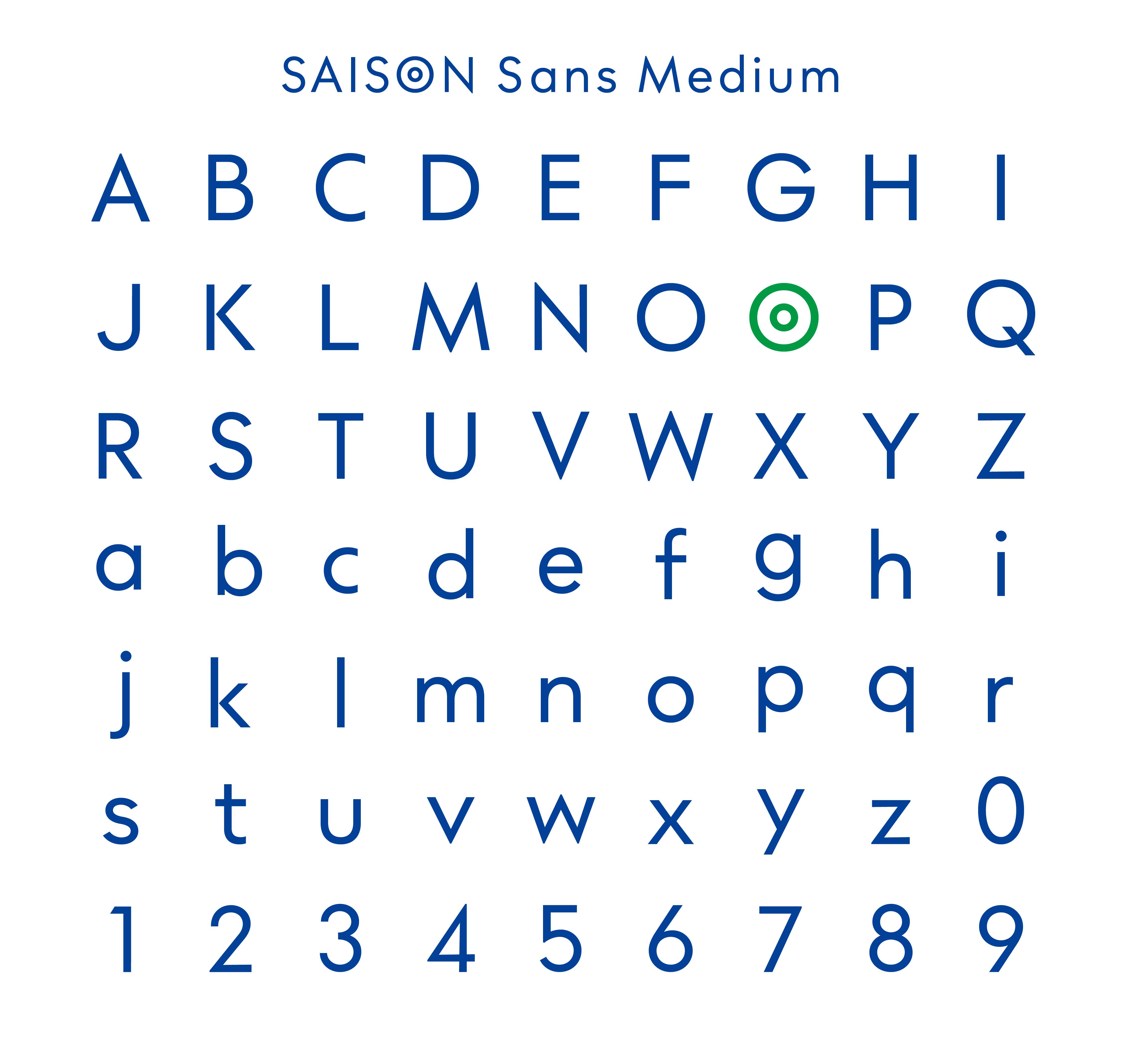
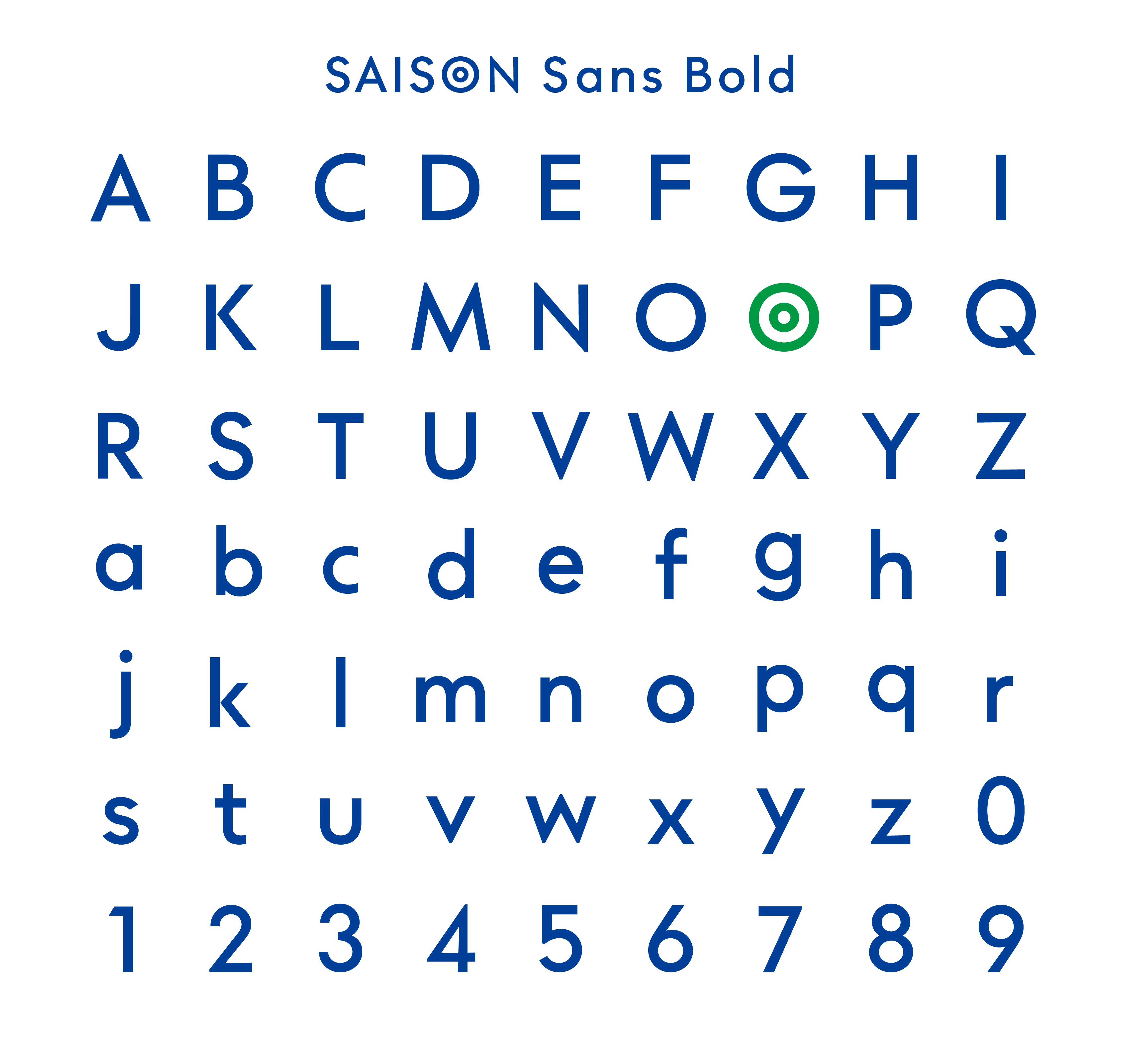
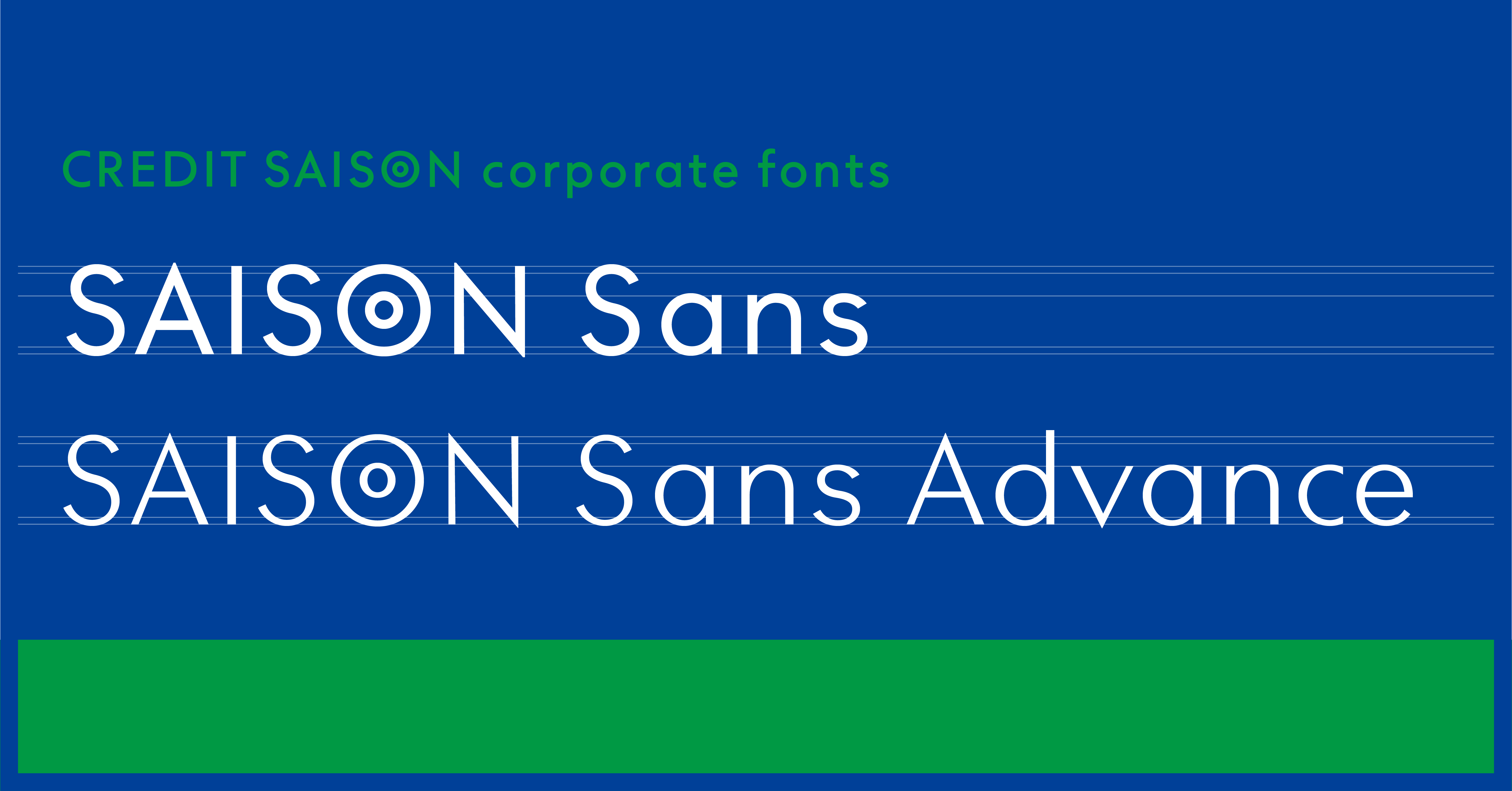
SAISON Sans and SAISON Sans Advance
take over the tradition of the brand and introduce new innovations.


Creative aspects
We have built a unique brand image
by constantly coming up with
topical catchphrases and imagery.
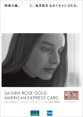
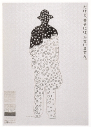
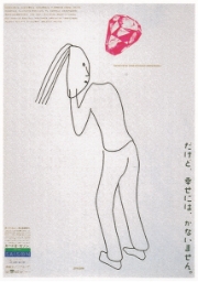
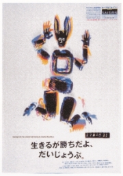
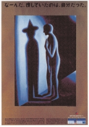
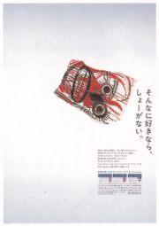
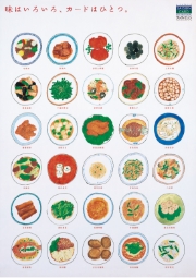
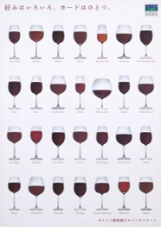
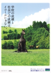
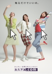
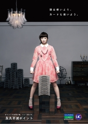
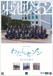
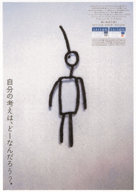
In order to distill Saison's uniqueness, we have always strived to create expressions that appeal to people's senses and transcend passing fads while capturing the spirit of the times. We value originality and have built our brand image through the continual creation of topical catchphrases and imagery.

-
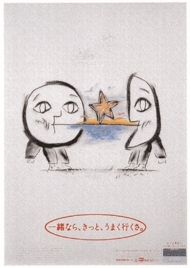
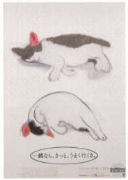
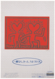
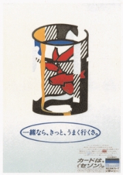
Together, we can do it.
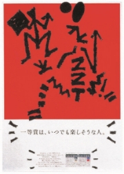
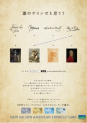
(1982~1984)In order to express the key concept of "communication," we used large, warm illustrations featuring the moon, the sun and a star as the main motif. As a latecomer to the card sector at the time, we resorted to ads based on contemporary art to make Saison cards immediately recognizable and create an aggressive and innovative image.

-

-
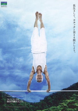
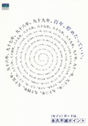
Continue saving, even for 100 years.
Saison Card and Eikyufumetsu Points
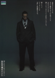
(2004)The commercial for this campaign featured an ordinary old man living in Shizuoka prefecture (68 years old at that time). Embracing his dream of being a successful gymnast, he showed off his athletic prowess in the commercials.

-
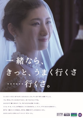
Together, we can definitely do it.
(2016)The “Together, we can do it” catchphrase was used when the first Seibu Card (now the Saison Card) was born in 1982. The term "together" includes not only customers and the Saison Card but also parents and children, couples, siblings and lovers, to stress the importance of interconnectedness in getting things done.

-
